
If you just began learning React or working on a React project, you probably want to create a beautiful slider that adds an aesthetic boost to your pictures. In this post, I will walk you through the React Swiper basics and help you create a slider component using the library.
Prerequisite
- Basic knowledge about react such as component, props
- A basic react app if you do not have it
- Open the terminal and enter this command shown below
npx create-react-app [your project folder name]Structure
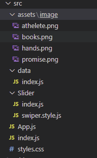
The picture above shows how the initial structure should look like. First, I imported a few modules from the Swiper library. Next, I created the Slider component index.js under the Slider folder and imported the Slider component App.js. Then, I created a Slider that shows the pictures. I created an array of data which is stored in a data folder with images in an asset folder.
Install Swiper library
Open the terminal and enter this command shown below
npm install swiperInstall Swiper modules
In index.js under the Slider folder, I imported only 4 modules from swiper library that are Navigation, Pagination, EffectFade, Autoplay. If you want to use other modules, you need to import the modules as well. you can find other modules on the website and their purposes.
Now, the Slider component could look like:
import {SliderWrap} from "./swiper.style";
// styled-component wrap
import {Swiper, SwiperSlide} from 'swiper/react';
// SwiperSlide is pretty self-explantory. it is one slide that would contain
// one of data you want to show
import SwiperCore, {Navigation, Pagination, EffectFade, Autoplay } from "swiper";

// install Swiper modules
SwiperCore.use([Navigation, Pagination, EffectFade, Autoplay]);

const Slider = ({children, settings}) => {
  const sliderOptions = {
    slidesPerView: 1,
    pagination: true,
    navigation: true,
    loop: true,
    // autoplay: {
    //  delay: 1000,
    //  disableOnInteraction: false,
    // },
    ...settings
    // Uncomment autoply option then you can see the swiper play automatically
    // you can override setting options pass settings props to this component
  };
  // swiper takes options as props
  // you can find more about options on the website link above

  return (
    <SliderWrap
      dots={sliderOptions?.pagination}
      arrows={sliderOptions?.navigation}
      // I pass dots and arrow props to custom pagination and navigation in styled-component
    >
      <Swiper
        {...sliderOptions}
      >
        {children}
      </Swiper>
    </SliderWrap>
  );
};

export {SwiperSlide as Slide};
export default Slider;
The comments in the code block might explain quite a lot. but, you may still be unsure of what swiper.style.js does or just what it is. this is a styled-component in order to apply css rules to the Slider component. Styled-component is a component in which you wrap a target component where you apply css rules. In a later post, I might go into greater details. In the meantime, here is the code:
import styled, {css} from "styled-components";

export const SliderWrap = styled.div`
  position: relative;
  .swiper {
    border: 1px solid #000;
    width: 80%;
    margin-top: 30px;
    margin-left: auto;
    margin-right: auto;
  }

  .swiper-slide {
    display: flex;
    justify-content: center;
    align-items: center;
    background: #fff;
    img {
      max-width: 50%;
      height: 300px;
    }
  }
  ${({arrows}) => arrows && css`
    .swiper-button {
      &-next,
      &-prev {
        top: 50%;
        z-index: 9;
        width: 40px;
        height: 40px;
        margin: auto;
        line-height: 40px;
        position: absolute;
        visibility: hidden;
        text-align: center;
        transform: translateY(-50%);
        color: #000000;
        transition: all 0.4s ease 0s;
        border-radius: 50%;
        background-color: #ffffff;
        box-shadow: 0 3px 25.5px 4.5px rgba(0, 0, 0, .06);
        &:hover {
          color: #212121;
          background-color: #ff7004;
        }
        &:after {
          font-size: 14px;
        }
      }
      &-prev {
        outline: 0;
        right: auto;
        left: -20px;
        &:after {
          margin-right: 3px;
        }
      }
      &-next {
        outline: 0;
        left: auto;
        right: -20px;
        &:after {
          margin-left: 3px;
        }
      }
      &-disabled {
        opacity: 0.1;
      }
    }
    &:hover {
      .swiper-button {
        &-prev, &-next {
          visibility: visible;
        }
        &-prev {
          left: 10px;
        }
        &-next {
          right: 10px;
        }
      }
    }
  `}
  ${({dots}) => dots && css`
    .swiper-pagination {
      &-bullet {
        cursor: pointer;
        width: 10px;
        height: 10px;
        display: inline-block;
        border-radius: 50%;
        background: #ff7004;
        opacity: 0.2;
        border: 1px solid #ff7004;
        margin: 0 5px;
        box-shadow: none;
        transition: all 0.4s ease 0s;
        transform: scale(0.8);
        &:hover, &-active {
          background-color: #ff7004;
          border-color: #ff7004;
          transform: scale(1.0);
          opacity: 1;
        }
      }
    }
  `};
`
Pictures
import Athelete from "../assets/image/athelete.png";
import Books from "../assets/image/books.png";
import Hands from "../assets/image/hands.png";
import PicPromise from "../assets/image/promise.png";
export const pictures = [
{
id: 1,
title: "athelete",
thumbnail: Athelete
},
{
id: 2,
title: "books",
thumbnail: Books
},
{
id: 3,
title: "hands",
thumbnail: Hands
},
{
id: 4,
title: "promise",
thumbnail: PicPromise
}
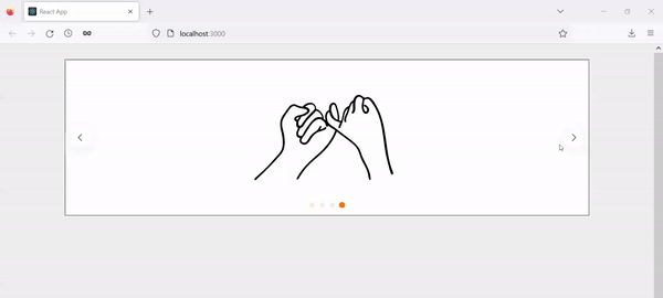
];You can replace these with your own images. Just make sure the path to the images is correct.
App.js
import Slider, {Slide} from "./Slider";
import { pictures } from "./data";

import "./styles.css";

import "swiper/css";
import "swiper/css/autoplay";
import "swiper/css/navigation";
import "swiper/css/pagination";
import "swiper/css/effect-fade";

function App() {
  return (
    <Slider
      settings={{
        navigation: true
      }}
    >
      {pictures.map((slide, index) => (
        <Slide
          key={slide.id ? slide.id : index}
        >
          <img
            src={slide?.thumbnail}
            alt={slide?.title}
          />
        </Slide>
      ))}
    </Slider>
  );
}

export default App;
Notice that I imported all the css files that are required.
Conclusion
Finally, we created a simple Slider component. There are a lot of different options to implement Swiper library. You might want to play with these variation by yourself and find what works for you!
I hope you enjoyed this article!
THANKS FOR READING. SEE YOU NEXT TIME!
This is originally posted on my Medium. Let's connect!