
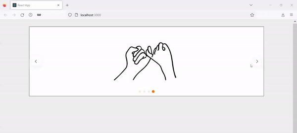
React를 배우기 시작하고 실제 웹사이트를 개발할 때, 그림 및 사진을 자주 활용할 기회가 있다. 특히 여러 사진을 한 영역 내에서 보여주는 형식을 흔하게 접할 수 있는데 React Swiper 라이브러리가 이 기능을 구현할 때 적합하다. 이 글을 통해 해당 라이브러리의 기본을 알아보자.
필수
- Component, props 등등 기초 React 배경지식
- 기본 React App
- React App이 없을 시, 아래 명령어로 입력하여 생성
npx create-react-app [your project folder name]폴더 구조
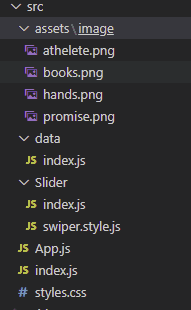
최종적으로 생성할 App의 폴더 구조를 나타내는 그림이니 참고하면 된다. 우선, Swiper 라이브러리에서 필요한 모듈을 import하고 Slder folder 하위에 Slider 컴포넌트가 들어있는 index.js를 생성한다. 이 컴포넌트 안에 우리가 원하는 Slider를 생성한다. 마지막으로 asset 폴더 안에 있는 data 폴더에서 Slider를 통해 보여줄 사진들이 저장되어 있다.
Swiper library 설치
아래 명령어를 입력하여 라이브러리를 설치한다.
npm install swiperSwiper modules 설치
Slider 폴더 안에 있는 index.js에 swiper 라이브러리에서 이 App에 활용할 4가지 모듈을 import한다. Navigation, Pagination, EffectFade, Autoplay들이 해당 4가지 모듈이다. 다른 기능을 사용하고 싶다면 해당 모듈을 import하면 된다. 다른 모듈에 관한 설명은 Swiper 라이브러리 공식 웹사이트에 나와 있으니 참고하면 된다.
Slider 컴포넌트:
import {SliderWrap} from "./swiper.style";
// styled-component wrap
import {Swiper, SwiperSlide} from 'swiper/react';
// SwiperSlide is pretty self-explantory. it is one slide that would contain
// one of data you want to show
import SwiperCore, {Navigation, Pagination, EffectFade, Autoplay } from "swiper";

// install Swiper modules
SwiperCore.use([Navigation, Pagination, EffectFade, Autoplay]);

const Slider = ({children, settings}) => {
  const sliderOptions = {
    slidesPerView: 1,
    pagination: true,
    navigation: true,
    loop: true,
    // autoplay: {
    //  delay: 1000,
    //  disableOnInteraction: false,
    // },
    ...settings
    // Uncomment autoply option then you can see the swiper play automatically
    // you can override setting options pass settings props to this component
  };
  // swiper takes options as props
  // you can find more about options on the website link above

  return (
    <SliderWrap
      dots={sliderOptions?.pagination}
      arrows={sliderOptions?.navigation}
      // I pass dots and arrow props to custom pagination and navigation in styled-component
    >
      <Swiper
        {...sliderOptions}
      >
        {children}
      </Swiper>
    </SliderWrap>
  );
};

export {SwiperSlide as Slide};
export default Slider;
주석에 코드에 대한 설명들이 자세히 적혀 있으나 React를 처음 접하게 된 사람들은 swiper.style.js가 정확하게 어떤 역할을 하는지 그리고 어떻게 활용하는지 궁금하실 수도 있다. styled-component라는 라이브러리로 Slider 컴포넌트를 감싸서 해당 컴포넌트에 css를 적용하는 역할을 한다. swiper.style.js 안에 아래 코드와 같이 적어본다:
import styled, {css} from "styled-components";

export const SliderWrap = styled.div`
  position: relative;
  .swiper {
    border: 1px solid #000;
    width: 80%;
    margin-top: 30px;
    margin-left: auto;
    margin-right: auto;
  }

  .swiper-slide {
    display: flex;
    justify-content: center;
    align-items: center;
    background: #fff;
    img {
      max-width: 50%;
      height: 300px;
    }
  }
  ${({arrows}) => arrows && css`
    .swiper-button {
      &-next,
      &-prev {
        top: 50%;
        z-index: 9;
        width: 40px;
        height: 40px;
        margin: auto;
        line-height: 40px;
        position: absolute;
        visibility: hidden;
        text-align: center;
        transform: translateY(-50%);
        color: #000000;
        transition: all 0.4s ease 0s;
        border-radius: 50%;
        background-color: #ffffff;
        box-shadow: 0 3px 25.5px 4.5px rgba(0, 0, 0, .06);
        &:hover {
          color: #212121;
          background-color: #ff7004;
        }
        &:after {
          font-size: 14px;
        }
      }
      &-prev {
        outline: 0;
        right: auto;
        left: -20px;
        &:after {
          margin-right: 3px;
        }
      }
      &-next {
        outline: 0;
        left: auto;
        right: -20px;
        &:after {
          margin-left: 3px;
        }
      }
      &-disabled {
        opacity: 0.1;
      }
    }
    &:hover {
      .swiper-button {
        &-prev, &-next {
          visibility: visible;
        }
        &-prev {
          left: 10px;
        }
        &-next {
          right: 10px;
        }
      }
    }
  `}
  ${({dots}) => dots && css`
    .swiper-pagination {
      &-bullet {
        cursor: pointer;
        width: 10px;
        height: 10px;
        display: inline-block;
        border-radius: 50%;
        background: #ff7004;
        opacity: 0.2;
        border: 1px solid #ff7004;
        margin: 0 5px;
        box-shadow: none;
        transition: all 0.4s ease 0s;
        transform: scale(0.8);
        &:hover, &-active {
          background-color: #ff7004;
          border-color: #ff7004;
          transform: scale(1.0);
          opacity: 1;
        }
      }
    }
  `};
`
사진
import Athelete from "../assets/image/athelete.png";
import Books from "../assets/image/books.png";
import Hands from "../assets/image/hands.png";
import PicPromise from "../assets/image/promise.png";

export const pictures = [
  {
    id: 1,
    title: "athelete",
    thumbnail: Athelete
  },
  {
    id: 2,
    title: "books",
    thumbnail: Books
  },
  {
    id: 3,
    title: "hands",
    thumbnail: Hands
  },
  {
    id: 4,
    title: "promise",
    thumbnail: PicPromise
  }
];
사진을 import 할 때, 정확한 path를 적어야 한다.
App.js
import Slider, {Slide} from "./Slider";
import { pictures } from "./data";

import "./styles.css";

import "swiper/css";
import "swiper/css/autoplay";
import "swiper/css/navigation";
import "swiper/css/pagination";
import "swiper/css/effect-fade";

function App() {
  return (
    <Slider
      settings={{
        navigation: true
      }}
    >
      {pictures.map((slide, index) => (
        <Slide
          key={slide.id ? slide.id : index}
        >
          <img
            src={slide?.thumbnail}
            alt={slide?.title}
          />
        </Slide>
      ))}
    </Slider>
  );
}

export default App;
필수적으로 import 해야 하는 css 파일들이 있어야 동작이 된다.
결론
간단한 React App으로 Slider를 구현했다. Swiper 라이브러리는 이 글에서 보여준 기능 이외에도 다른 기능들이 있으니 사용자의 의도와 목적에 맞게 적절하게 개발하시길 바란다.
이 글이 React Swiper에 관해 찾는 분들께 도움이 되었으면 좋겠습니다!
읽어 주셔서 감사합니다. To be continued!
이 글은 Medium에도 업로드 되었습니다. 놀러 오세요!